Being a B2B marketer isn’t easy.
Because we sell our products and services to other businesses instead of directly to consumers, sometimes our marketing material can come across as distant and downright boring.
It’s easy to forget that, although we’re marketing our products and services to other businesses, we’re still selling to human beings.
It’s easy to forget that, although we’re marketing our products and services to other businesses, we’re still selling to human beings.
Plus, a lot of the marketing advice out there really only speaks to B2C brands. Sure, there’s some carryover, but the strategies that reach consumers won’t always work the same way when you’re speaking to other businesses. If you’re a B2B marketer, you have to take the extra step to consider how that advice applies to your world.
So today I want to walk you through a before-and-after website makeover of Boomer Consulting, a B2B company based in Manhattan, Kansas, that consults with accounting firms. They signed up for one of our StoryBrand Workshops. With what they learned there, they confidently executed a smart, sophisticated redesign.
As we study both the before and after versions, you’ll see the common mistakes we see in B2B websites — and exactly how Boomer overcame those mistakes and created a stunning website.
Your B2B marketing material doesn’t have to be uninspiring. Take a page out of the playbook at Boomer Consulting and I know you’ll be on your way to growing your business.
Having too many stakeholders creates website clutter
B2B website redesigns often have a lot of stakeholders from all over the company involved. Each of them seems to have a “pet” element they want to see represented in the final product.
If you indulge each voice, you end up with a disjointed mess. Each stakeholder may be satisfied individually, but the end result will confuse your prospects and customers, and they’ll move on.
You can see a lot of this kind of clutter in the old version of Boomer’s site.
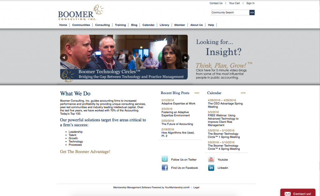
I count a whopping ten elements crowding the top navigation bar. Plus, including a calendar on the home page may have been important to whoever runs the calendar, but it doesn’t do much to convert visitors into customers.
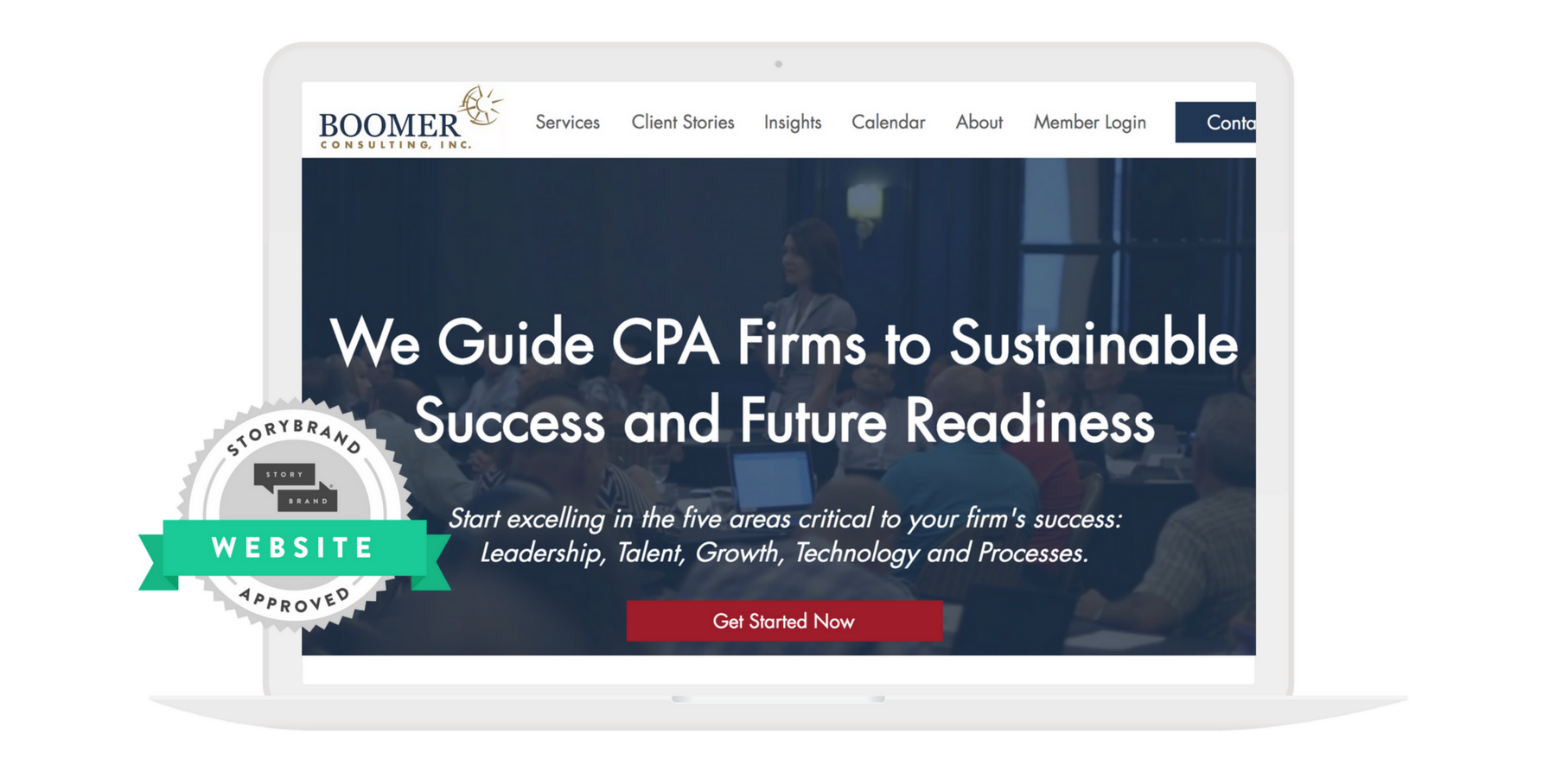
In the redesign, the disjointed elements — including the calendar — are all gone. The navigation is trim and tidy. And most importantly, the site functions as a cohesive whole.
All the various clutter isn’t competing for our attention anymore. We’re free to focus on one single idea. It’s the most important message they have: we help your accounting firm grow.
This new site is wonderful because it satisfies the needs not of many internal stakeholders but of one person: the prospective customer.
This new site is wonderful because it satisfies the needs not of many internal stakeholders but of one person: the prospective customer.
For B2B marketers, beware the “death by committee” that can happen when you work on marketing collateral, especially your website. It’s great to involve key stakeholders in the design process. But make sure they understand that the prospective customer is ultimately the primary person you’re designing for.
Start by questioning the assumptions behind every element on your site. For example — why do we have this “Community Events” tab over here? Is it relevant to our prospects right now? You should be able to justify and defend every element by how it serves the person visiting your site.
Dry, overcomplicated language bores and confuses prospects
Our brains have a thankless task. Every day, they are constantly sorting through the bombardment of information around us and discarding anything irrelevant.
Why? Because ultimately, our brains are trying to keep us alive. All that processing takes energy, in the form of calories burned. And your brain wants to conserve those calories.
Remember, we were hunters and gatherers once. We didn’t always know where our next meal was coming from. Our brains haven’t really been re-wired just because the grocery store is down the street now. To our brains, calories are life-giving and precious — and it wants to conserve them.
So what does all that mean for your website?
When our brains run into difficulty processing information, we ignore the source of that information in an effort to conserve calories.
Yet most B2B websites are jam-packed full of five-dollar words, long sentences, and complicated jargon. It takes a lot of will — and yes, calories — to process it.
Check out the super-long sentence on the original version:
That’s not marketing for customers. It’s a mission statement for the board.
For some reason, B2B marketers justify this kind of language by claiming it’s industry terminology that everybody’s used to.
But the reality is, the brain is operating in the same way whether you’re marketing to a person who’s a consumer or to a decision-maker on behalf of a business. It’s trying to conserve calories, and it’ll tune out the moment it has to burn too many of them to process the information we’re sharing.
I love the language shifts in Boomer’s redesign.
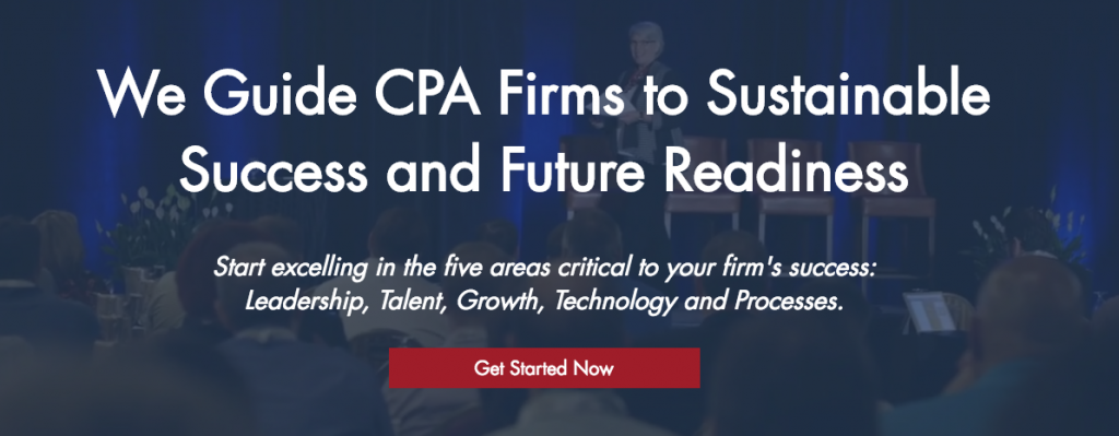
First, the “mission statement” speak is gone. In a third of the characters of the original copy, they expressed the same basic idea — just more clearly and simply.
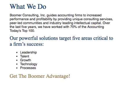
BEFORE: 197 characters
Boomer Consulting, Inc. guides accounting firms to increased performance and profitability by providing unique consulting services, peer-led communities, and industry-leading intellectual capital.
AFTER: 62 characters
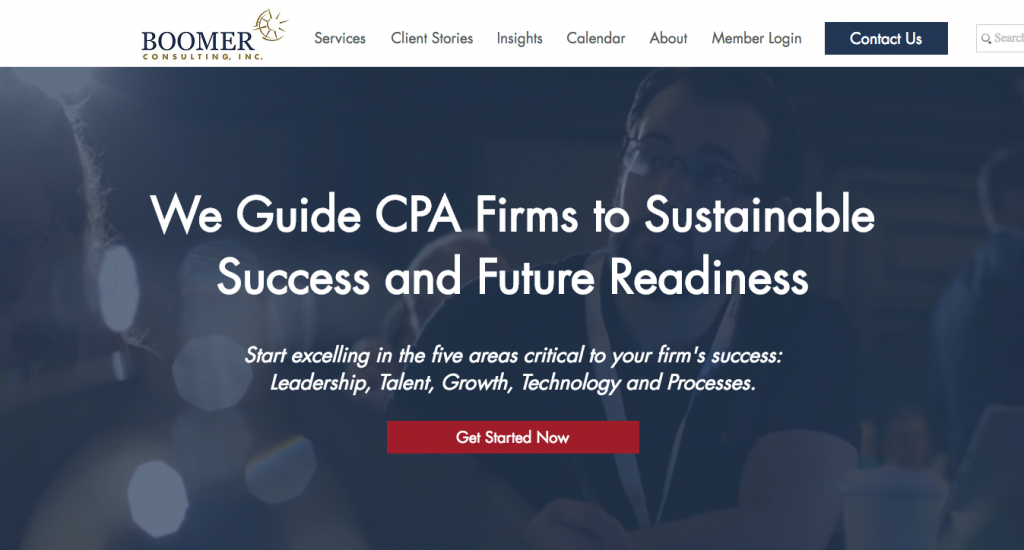
We Guide CPA Firms to Sustainable Success and Future Readiness
Second, the language is more focused on the prospective customer. Instead of drily explaining the company to them, Boomer now strives to make a connection with them.
You see it beautifully when you compare this old copy:
Our powerful solutions target five areas critical to a firm’s success
To the new version:
Start excelling in the five areas critical to your firm’s success.
Ultimately, you’re not selling to businesses. You’re selling to people.
B2B marketing is no excuse to use jargon and complicated sentences. Be clear and direct in your communication. Don’t use 197 characters when 62 will do!
Ultimately, you’re not selling to businesses. You’re selling to people. The people you’re speaking to have brains that are trying to conserve calories, and the five-dollar words are costly. So speak to them directly if you want them to engage with your message.
The path to action is poorly defined
Let’s say you’ve created a cohesive, uncluttered site that resonates with your prospects. They’re ready to take action. Good job! Now what?
A lot of B2B sites will just slap a basic “contact us” form or button on the site and hope their prospects click it. At best, that click opens up an involved form to fill out. At worst, users have to literally write an email from scratch.
You’ll see this on the old version of Boomer Consulting’s site — a bland “contact us” button languishing at the bottom of the page.
The problem with this? First, it’s easy to miss. Second, it doesn’t really explain what happens once you click it.
When you ask people to go from browsing your site to actually reaching out, you’re asking them to take a big step. It’s risky and a bit unknown, which is what causes a lot of people never to inquire at all.
To combat this, give your customers a plan that shows what happens when they reach out.
I love the way Boomer breaks it down in the new version of the site.
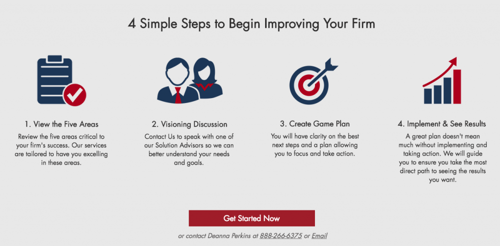
By giving people a plan to follow, they’ve alleviated the confusion or sense of risk that’s keeping their prospects from taking action.
Ask yourself: what steps do people need to take to do business with you? What does it look like to experience your business’ product or service, and how can you break that down into easy-to-follow steps?
Spell out those steps, like Boomer does here, and it’ll be as though you’ve paved a sidewalk through an overgrown field. And guess what? A lot more people will cross the field.
—
Don’t fall into the common B2B traps that end up costing your company valuable business. Avoid these mistakes and you can create a compelling B2B website that truly connects with your prospects and grows your company.