Have you ever launched a redesign of a website? You’ve worked for what seems like forever. You’ve spent a small fortune. And once it finally goes live, you sit back and wait for a huge uptick in inquiries, sales, and engagement.
That’s the dream, right?
But all too often, those big increases don’t come after you redesign your site. You see a small improvement that quickly levels out, and you’re left feeling discouraged, wondering why all that time and money didn’t actually make a difference. If it’s happened to you, you know: it’s an awful feeling.
But it doesn’t have to be that way.
Meyer’s Pet Care is a doggy daycare service in the Chicago area owned by Gwen Meyer. Gwen is passionate about caring for animals — not necessarily passionate about marketing. But in order to give dogs the care they deserve, she embraced her inner marketer, went through the StoryBrand Online Marketing Workshop and the StoryBrand Roadmap course, and started to think differently about how to build a great website.
When they launched the redesigned version, they had that “dream” response, with inquiries quadrupling and traffic skyrocketing within a matter of days.
We were all cheering at the office when Gwen sent us this amazing note:
Requests for our doggie daycare program have quadrupled. And within the first three weeks, our site had over 300 clicks from the Chicago suburbs, which prior we had only 12 clients. It is very new but we can’t believe the increase in traffic to our business through the new improved website.
So how did they do it?
In this blog post, we’ll take a closer look at their new site and why it works so well.
But we’re also going to study what it looked like before, so you can see exactly the kinds of changes that had to happen.
You’ll see three key shifts they made. If you need to redesign — or even just tweak — your site, apply these same shifts. I am confident you’ll be able to experience the same kind of “dream” results Gwen and her team are today.
Key #1: Make the value instantly clear to customers
In every decision we make building our websites, we’re either serving the overall story or we’re confusing our customers. We’re either making music or making noise.
In every decision we make building our websites, we’re either serving the overall story or we’re confusing our customers. We’re either making music or making noise.
Nobody likes noise, right? We tune it out. And before their redesign, Meyer’s had a “noisy” site.
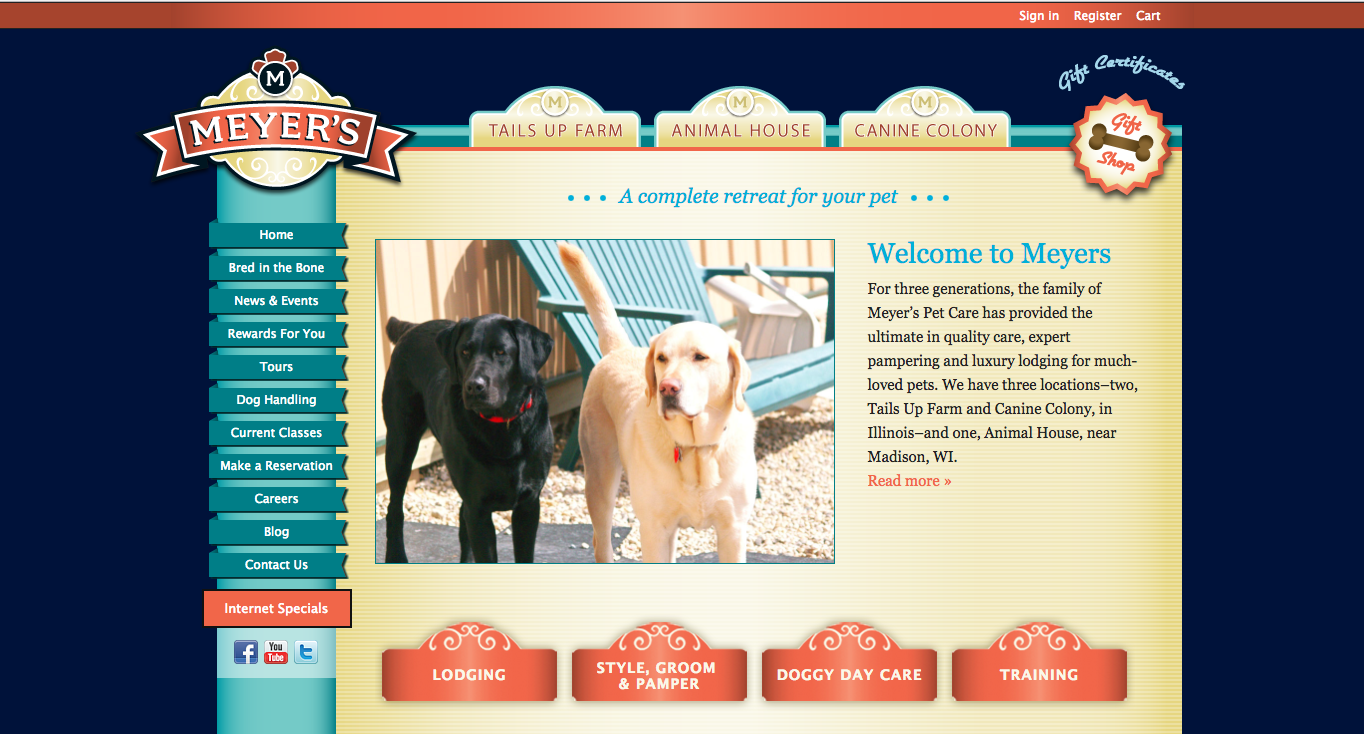
There’s a lot going on, and as a first time visitor, it’s not immediately clear to me how this business is going to make my life better.
It’s a common misstep. We’ve reviewed thousands of websites with copy that had nothing to do with the story of the customer. As a result, customers tune out and move on.
In their redesign, they NAILED it. Every element points toward the customer’s story: I want my dog to receive great care, even when I’m not around to give it to him.
How They Did It:
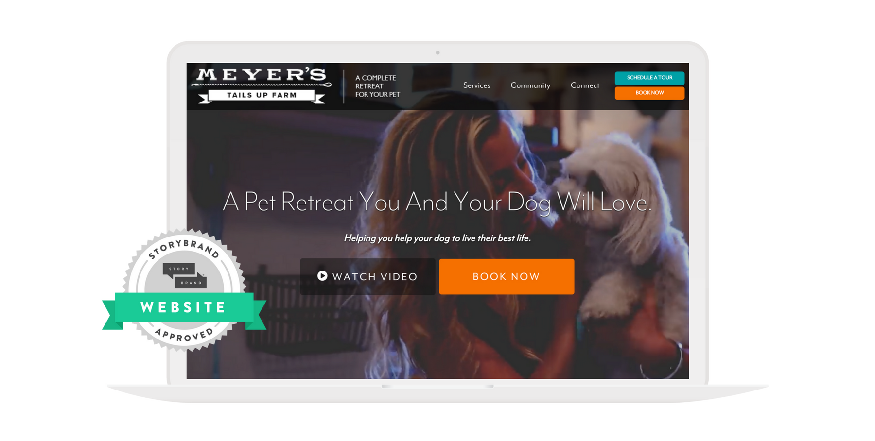
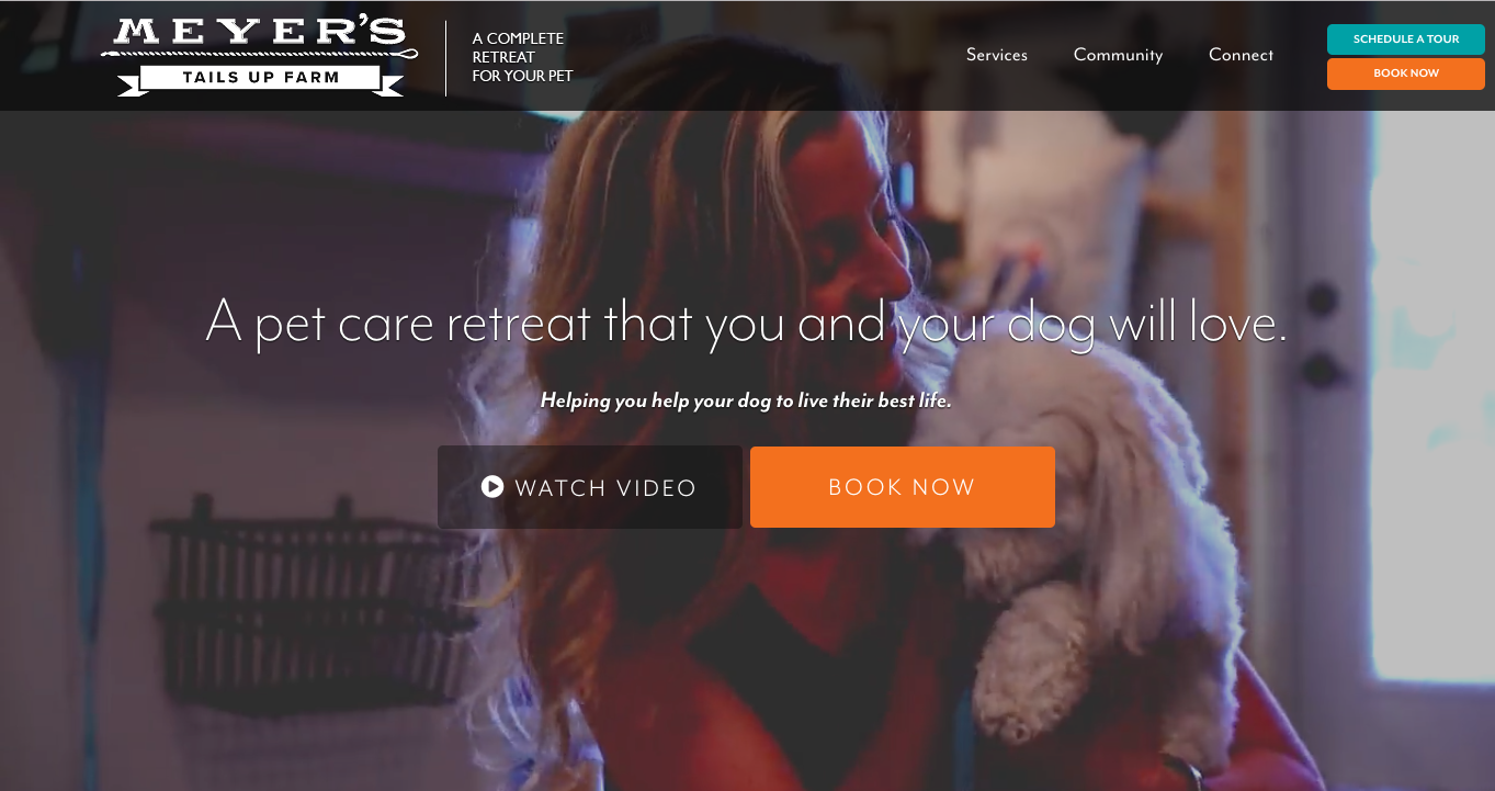
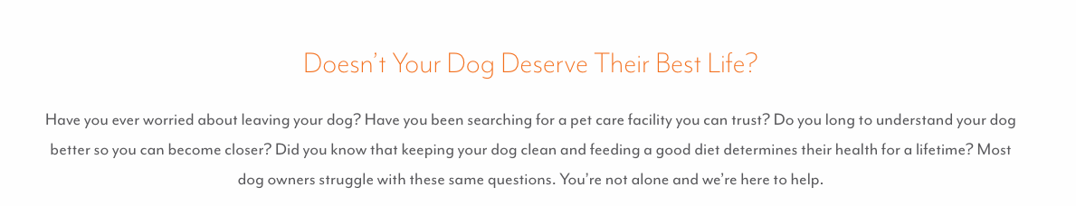
- The “one-liner” says exactly what they offer: “A pet retreat you and your dog will love.” Gone is all the stuff about “Welcome to Meyers” and “For three generations…” That’s nice, but ultimately it doesn’t serve the customer as well as simple language that says what they do and why it matters.
- Images show the “customer story” in action. It’s hard to go wrong with dog pictures, of course. Who doesn’t love those faces? But in the old version, the pictures lacked context. Now, we get visuals of the dogs WITH their owners. Ultimately, the story they’re telling is about your relationship with your dog. The visuals communicate that beautifully.
Key #2: Clarify how customers should take action
In stories, characters don’t take action on their own. They must be challenged. For example, if we’re telling a story about a man who just decides to lose 30 pounds on his own, the audience is going to check out. There needs to be a reason for his action, a catalyst. Maybe he loses a bet and has to run a marathon.
This principle is true for stories, and it’s true in marketing, too. Our customers only take action when their story challenges them to do so.
In the old version of their site, Meyer’s wasn’t defining that clear path of action for their prospective customers. There were no fewer than nineteen similarly-sized buttons to choose from on the old site. Without a clear path laid out for them, people weren’t moving. You’d be surprised how many companies make this same mistake.
When they redesigned the site, Meyer’s made it abundantly clear what next step visitors should take. It took a lot of ruthless editing of site paths that seemed important to them but were ultimately confusing their customers.
How They Did It:
- The main call to action is unmissable. You can’t avoid that “BOOK NOW” button, can you? It’s presented clearly as the next natural step after that strong, value-packed headline. And it stands out beautifully thanks to the orange color choice. You’ll also notice they’ve included a “transitional” call to action in a more subdued color. This option to “Watch Video” helps to engage customers who aren’t quite ready to book an appointment yet, keeping them from leaving the site altogether.
- The top navigation menu is well edited. Those nineteen buttons are long gone, and now we’ve got a tidy navigation menu at the top of the page to highlight the most important next steps prospects can take to learn more.
Key #3: Elevate authority and empathy
We’ve have seen thousands of businesses experience a dramatic increase in engagement and revenue by doing one simple thing: positioning themselves not as the hero of the story, but as the guide who helps the customer — the real hero — succeed.
In the prior version of the site, Meyer’s messaging was facing the wrong way, so to speak. The copy focused more on why Meyer’s is great: they’ve been doing this for three generations, they’re the experts, etc.
The new copy makes the customer (and the customer’s dog!) the hero: “helping you and your dog live their best life.”
By positioning themselves as a guide, they can do two things: one, show the customer that they can help her overcome whatever she’s struggling with; and two, they can move the hero in the story along toward taking action. Let’s see how they executed this guide positioning in the redesign.
How They Did It:
They use social proof to establish authority. As you scroll down the home page, you see a video of a satisfied customer, a strong testimonial, and even media outlets who’ve featured their services. All of these “social proof” elements point to people outside the company who can vouch for how well Meyer’s serves dogs and their owners.
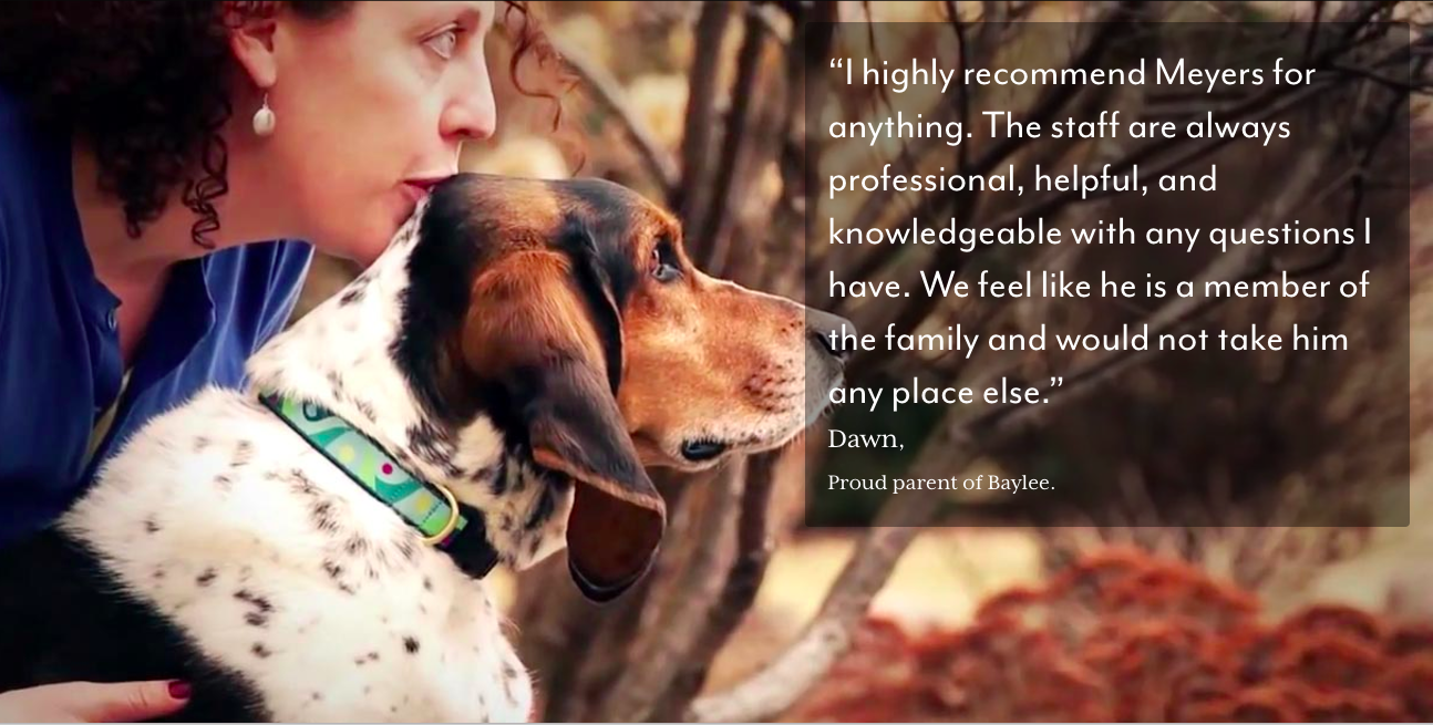
They got the right kind of testimonials. Not all testimonials create authority and empathy. Simply quoting a customer who said, “These guys are great!” doesn’t do much to establish trust.
Instead, Meyer’s focused on capturing customer testimonials that communicated how a customer’s life improved because they chose their service. This kind of testimonial actually sells your product or service because it proves how well your brand solves problems.
For example, instead of asking, “Why do you like Meyer’s Pet Care?” she dug deeper, asking questions like: What’s it like for you now when you drop your pet off, knowing how Meyer’s cares for your pet?” and “What was the most important thing you wanted for your pet that you may have not been getting?”
They put these testimonials together in a powerful video that would convince most anybody on the fence that Meyer’s is a safe and nurturing place for their dog:
*30 second clip of their full video.
They use copy that communicates empathy. A good guide expresses an understanding of the pain and frustration of the hero. Real empathy means we resonate with customers in a way that lets them know their concerns are valid and they’re not alone.
Take this copy from farther down the page, for example. In just a few words, they communicate how well they “feel the pain” of wanting your dog to be happy.
—
Because of these changes, more dogs are getting great care, and more humans feel great knowing they’ve given their dog that great care. And with the boost in revenue, Gwen and her team feel confident knowing they can continue to grow this amazing business.
Don’t go through the expense and time of a site redesign, only to see little to no effect on your bottom line. Use these three key shifts to guide you, like Meyer’s Pet Care did, and I know you’ll be emailing us after your “dream” results become a reality!
Need Help With Your Website Redesign?
You don’t have to go it alone. Just like the Meyer’s team, you can come to us for help. Our StoryBrand Online Workshop will help you clarify your company’s story in a way that resonates with customers and grows your business.